All about Philip
Games I worked on
My Miata
My Norton
The Gallery
Creating a Gryphon
|
This is page five of a combination tutorial and creation log of the steps I went through creating a gryphon model in Animation:Master. |
|
Time to do feathers! The geometry on these is both simple, and a bit tricky. I tried a few things, and I'm pretty happy with this. I basically did a 3-point lathe, for the shaft, and then simply drew out the patches for the feather itself. The 'top' of the shaft is flattened a bit by simply adjusting the CPs, and that mirrors life very nicely. The feather itself has no thickness at all - any that you see is due to it's curvature, and the quill. Having made this basic shape, you can then extrude it as far as you need to. I trimmed a bit, for the very base of the quill, but since nobody's actually going to see that, I'll probably wind up removing it. This basic shape is going to work for all of the primaries, with subtle variations, and mindor modifcations of the geometry so the quill is more centered will make it work for just about all the rest. It's very handy to have a scan of a feather to work with as reference - there's many out there on the net, and in various resource books. However, if you should happen to find a complete set of images of all the primaries, seperated out, bookmark it and tell me! |

|
|
Remember how I said this was going to be sort of a 'learn as you (and I) go' thing? Well... here's some more learning! D'oh! I forgot an important detail - A:M can't really cope with having two textures on the same patch. So... in order to have a top side and bottom side, with different colors and textures (which is true of basically all raptors), the feathers have to be a little more complicated. Not really a big deal - now the central spine has 5 points, and each outer part has three.
This is just the 'short' side - the 'long' side is just a mirror, as in the first attempt. The resulting feathers look exactly the same, they're just a bit more flexible in terms of what you can put on them. |

|
Here it is, with just the fore part showing - the detail of the edge gets lost, when the feathers are in place. Which is good - that's what we want! |

|
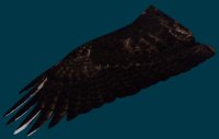
You know, this just never ceases to amaze me. Even without ANY tweaking to speak of, laying down a texture makes an incredible difference to a model. The pale areas on some of the primaries are due to the fact that the picture of the wing I'm using doesn't line up quite perfectly with the feather geometry. I can fix this one of two ways - move the feathers slightly, or smear the paint around. I think I'll actually be doing a combination of each. Ideally, you'd be a fabulous artist, and be able to take this image, which is simply a snapshot of the geometry, and then paint over it - thus guaranteeing that everything lines up perfectly. I, however, suck as an artist, so... that's not really an option. Also note that, ideally, you'd make quite a lot of images, each with a different feather fully rendered out, so that when the feathers shift, each one would have it's own, full coloring applied over it's entire surface. As it is now, each one will have just the image of the entire wing - including the bit of feather that overlaps it. I'm not real sure how this will look, during animation. Fixing it (as described above) is straightforeward, but incredibly tedious, so I'm going to avoid it for now. |
|
So.... now we've got everything in place. The wings are built, and both legs are built. Now comes the part I've been dreading... and putting off for way too long. Attaching them. This is something I have very little experience with, and is where the real problems of my design are most likely to surface. But no more putting it off! Time to dive in! |


